Why Your Site Has 10 Seconds to Engage Users
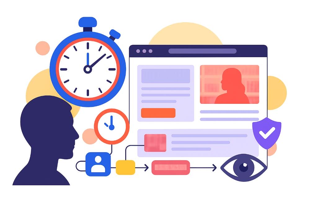
You don’t get long to make an impression online. In fact, research shows users form an opinion about your site in just 0.05 seconds. In the adult industry, that snap judgment is even harsher. Visitors arrive cautiously, mainly because they’re looking for trust signals, clarity, and a reason to stick around. If they don’t see those things straight away, they won’t scroll or engage… they’ll just leave.
That’s why your above-the-fold section (the very first screen someone sees) is the most valuable real estate on your site. Those opening 10 seconds decide whether someone becomes a paying customer or leaves to look elsewhere. So, how do you make those seconds count? Let’s find out.
Need a homepage that grabs attention from the very first glance? Our adult web design team specialises in creating designs that turn visitors into customers.
Contents:
- Why the First 10 Seconds Matter More Than You Think
- What Customers Expect Immediately
- What Not to Do With Your Homepage
- What Makes For a High-Converting Hero Section
- What a Good Above-the-Fold Section Looks Like
- How to Test and Optimise Your Above-the-Fold Section
1. Why the First 10 Seconds Matter More Than You Think
Most people never scroll. Studies show that if the top of your site doesn’t connect with them instantly, they’ll exit and look elsewhere. In the adult industry, this is amplified: users are wary of scams, poor quality, or sites that look outdated. High bounce rates on adult sites aren’t always about bad content, but often about weak first impressions that kill engagement before it even starts.
Your above-the-fold area acts as your credibility test. If someone lands on an escort agency site and can’t immediately see any profiles (or tell if they’re real), they won’t scroll further. If a toy store doesn’t highlight the different categories or just looks cheap from the outset, shoppers hesitate. If a cam or porn site looks cluttered, users assume the experience will be just as messy.
This is why “above the fold” matters so much: most users will only judge you on what they see without scrolling. If you don’t get the basics right — clarity, trust, relevance, and appeal — you’re bleeding customers before they’ve even had the chance to engage with your content.
Want more ways to boost visibility and engagement? Check out our 7 SEO tips to rank higher on Google.
2. What Customers Expect Immediately
The second someone lands on your site, they’re asking themselves three questions: What is this? Is it for me? Can I trust it? If you don’t answer all three straight away, you won’t win their engagement. Instead, they’ll leave before they click, scroll, or interact. In this day and age, with stricter moderation under the Online Safety Act, those trust signals matter even more.
For escort agencies, that means showing clear, verified profiles and proof of legitimacy up front. For toy stores, it’s reassurance about discreet packaging and a quick way to browse products. For cam or porn platforms, it’s about excitement and exclusivity — why should someone join your site instead of the hundreds of others?
Clarity is everything. Your headline should tell people exactly what they’ll get. Your design should feel relevant to their expectations. Trust signals (like SSL badges, reviews, or press mentions) should be visible without scrolling. And most importantly, your above-the-fold needs to appeal to the visitor emotionally — whether that’s with a promise of discretion, a wide and unique variety of offerings, or perhaps even a sense of exclusivity.
If you don’t deliver those signals in the first 10 seconds, good luck engaging those customers… users won’t stick around to find them buried further down the page.
3. What Not to Do With Your Homepage
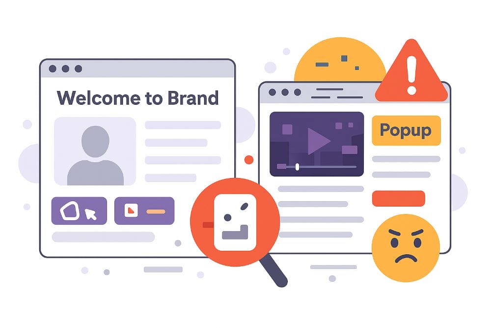
Most adult sites fail not because of bad content, but because of bad first impressions. A lot of homepages still make the same mistakes that instantly kill trust and stop engagement in its tracks:
Generic stock photography that looks nothing like your service. Dull headlines that say nothing more than “Welcome to [Brand Name].” Homepages with no obvious call-to-action, which leave visitors wondering what to do next. Sites with no sign of security, discreet billing, or authenticity. Or the worst offender: cluttered layouts that bombard people with too many menus, popups, and autoplay videos before they’ve even read a word.
All of these errors send one message: this site isn’t professional, and it might not be safe. In an industry where customers are already cautious, those signals are quite important. Remember: if people don’t trust you, they won’t engage with you… let alone buy from you. Cleaning up your above-the-fold design is one of the simplest ways to lower bounce rates and start building engagement from the first click.
Struggling to figure out what’s turning users off? Our adult SEO team can audit structure, on-page signals and UX basics so your homepage clears the trust test fast.
4. What Makes For a High-Converting Hero Section

So what actually works above the fold? It comes down to a simple mix: a headline that tells people exactly what you offer, a visual that backs it up, a clear call-to-action, and a reason to trust you.
A strong headline should be short, bold, and benefit-driven. If you’re a sex toy brand, it could be as simple as “Discreet Toys Delivered Tomorrow.” For an escort agency, it might be “Verified Companions in London — Available Tonight.” Both tell the visitor immediately what they’ll get and why it matters. Underneath, a subheadline can add reassurance, like “Free discreet packaging” or “100% real profiles.”
Your CTA button should be impossible to miss. “Browse Escorts,” “Start Shopping,” or “Join Now” work far better than vague phrases like “Learn More.” The earlier the user sees that next step, the more likely they are to take it. Trust signals are just as important. Show SSL padlocks, discreet billing policies, 5-star reviews, or even press mentions (earned through smart PR & outreach) where people can see them without scrolling. They’re not decoration — they’re proof you’re safe to buy from, which gives users the confidence to engage further.
And then there’s the visual. Too many adult sites rely on generic stock shots or overused graphics that feel fake. Instead, your image should support your value proposition. A clean product teaser works better than a messy collage, and a high-quality escort headshot builds far more trust than a blurred silhouette. As well as catching the eye, you want your above-the-fold to instantly confirm to the visitor that they’re in the right place and safe to engage with your brand.
Think there might be another reason why your conversions are low? Read our helpful guide explaining why your adult website might not be converting (and how to fix it).
5. What a Good Above-the-Fold Section Looks Like
One of the easiest ways to see the difference is to look at what others are doing. You’ve probably come across toy stores with a hero banner showing nothing but a random stock couple and a headline like “Welcome to SexyFunShop.” No mention of discreet delivery, no CTA, and no clear reason to trust them. That site loses customers before they even think about scrolling, mainly because there’s nothing to engage with.
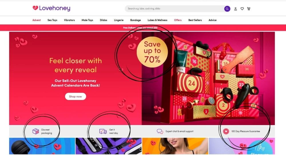
Now compare that with a brand like Lovehoney. Their hero section makes it crystal clear what they sell, highlights discreet packaging, as well as next-day deliveries and satisfaction guarantees, and they even promote some enticing deals. The difference is night and day. One site feels vague and unsafe, while the other feels trustworthy and ready to engage with. Escort agencies and cam platforms face the same challenge… if your hero looks cluttered, dated, or anonymous, people assume the rest of your site is the same.
The lesson is simple: users judge fast. Above the fold is where credibility is either built or lost. Get the basics right and people will scroll, click, and engage. Get it wrong and they’ll bounce in seconds, no matter how good the rest of your site might be.
Want an example of how a top-quality homepage can deliver results? Read our Blue Monday case study, and learn how we helped this client climb into the top 6 position on Google.
6. How to Test & Optimise Your Above-the-Fold Section
Even the best-designed hero section isn’t set-and-forget. The smartest adult brands test and refine constantly, because small tweaks above the fold can mean thousands in extra revenue and stronger customer engagement.
Start by tracking how people actually behave on your homepage. Tools like Hotjar or Microsoft Clarity will show heatmaps of where users click, how far they scroll, and what they ignore. If your CTA button is barely touched, it’s not positioned or worded right. If people drop off without scrolling, your headline isn’t convincing them to stay engaged.
Google Analytics 4 can also give you scroll-depth and bounce rate insights. Pair this with A/B testing — run two versions of your hero with different headlines, images, or CTA wording, and see which drives more clicks or engagement. Sometimes a small change like swapping “Join Now” for “Start Watching Tonight” can transform results.
And don’t forget speed. If your hero takes too long to load, it doesn’t matter how good it looks… users will leave before they see it. Compress images, optimise your hosting, and keep the design clean so it loads instantly on mobile. In the adult industry, most traffic is mobile, so if your hero doesn’t work perfectly on a small screen, you’re losing half your audience before they engage at all.
Want to know what else separates the high-performing sites from the bad? Check out our 10 essential website features every adult business needs.
Ready to Increase Engagement From the First Click?
Most adult businesses lose customers in the very first 10 seconds. It’s not because their content is bad, but because their homepage fails the instant trust test. If your above-the-fold section isn’t clear, relevant, and reassuring, people won’t engage at all. But get it right, and you’ll turn casual visitors into loyal customers from the moment they land.
It matters not whether you run an escort agency, a toy store, a cam platform, or a subscription site; those first 10 seconds decide everything.
Book a free consultation with our design team today, and we’ll show you how to transform your first impression into lasting engagement.
