Why Your Adult Website Isn’t Converting (& How to Fix It)

So, you’ve got yourself a nice-looking adult website. Whether it’s selling sex toys, running an escort agency, or offering exclusive fan content, you’ve invested a lot in your platform to help it stand out from the competition. You’re getting plenty of traffic, but conversions? Not so much.
Don’t worry, you won’t be the first business owner to face these hurdles. The adult industry is highly competitive, after all, and there are specific nuances in play that could be holding you back.
Join us here at Adult Creative as we explore the top reasons why your adult website isn’t converting and, more importantly, how to fix it.
Contents:
- You’re Not Utilising SEO
- Your Value Proposition Isn’t Clear
- Your Website is Slow
- Your Site Isn’t Mobile-Optimised
- Your Navigation is a Mess
- Your CTAs Are Weak or Nonexistent
- Cheap-Looking Web Design
- Boring or Generic Content
1. You’re Not Utilising SEO
SEO (otherwise known as Search Engine Optimisation) plays a large role in driving traffic to your adult site, and of course, converting visitors into paying customers. Whatever kind of adult site you’re running, the right adult SEO strategy ensures you rank high in search results for relevant keywords.
Search Engine Optimization (SEO) is crucial in driving high-quality traffic to your adult site, helping to attract visitors who are already interested in your services or products. But remember, while SEO brings in targeted traffic, it doesn’t automatically guarantee conversions. To truly capitalise on this, you’ll need to keep those users engaged through relevant content and consistent re-engagement strategies.
Research shows that websites with optimised SEO have a 14.6% close rate compared to traditional outbound methods, which only achieve around 1.7%. This is because SEO drives qualified traffic – people already in the purchase mindset – making it more likely for them to convert.
How to Fix It:
Start by identifying high-intent keywords that align with your business, such as “female sex toys” or “high-class London escorts.” Make sure these keywords are integrated naturally into your site’s content, meta descriptions, and headings. Also, use tools like Google Analytics and Google Search Console to track performance and continuously refine your strategy based on what’s working. For added insights, implement re-engagement strategies like email marketing or remarketing campaigns to convert returning visitors.
To learn more about why SEO is important for your adult e-commerce business, click here
2. Your Value Proposition isn’t Clear
In this competitive industry, you’ve got mere seconds to convince visitors why they should stay on your site instead of bouncing to a competitor.
Whether you’re running an adult e-commerce store, escort agency, or porn site, visitors need to know exactly what you offer and why it’s better than the rest. If your site doesn’t clearly communicate your value – whether that’s exclusive content, premium services, or unique products – customers will go looking for a site that does.
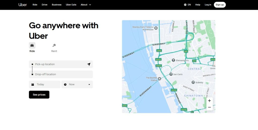
Below is a good example of telling visitors what the page is about simply and clearly:

How to Fix It:
Highlight your unique selling proposition (USP) prominently. For porn sites, this could be exclusive content from top stars or hard-to-find niche videos, whilst escort agencies can emphasise verified profiles and premium services.
Use bold headlines, high-quality images, and clear messaging that immediately tell visitors what sets you apart. Add visuals or taglines that showcase your offerings, like “The widest range of BDSM toys” or “VIP escorts available 24/7”, and make sure this messaging is consistent throughout your homepage and landing pages. Check out Podium’s guide on crafting a compelling value proposition for further details.
3. Your Website is Slow
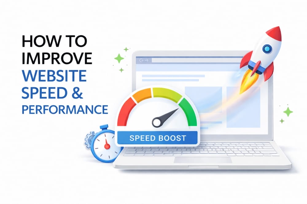
According to Google themselves, if your website takes longer than three seconds to load, you’re losing potential customers. Envisage Digital’s 2024 stats show that even a one-second delay in web page load time will result in 16% lower user satisfaction. The slower a site is, the higher the bounce rate will be.
So, as you may have guessed, users expect quick access to what they’re looking for. Not only are slow load times quite frustrating for visitors, but they will also most definitely hurt your SEO rankings, therefore reducing traffic and, ultimately, conversions.
How to Fix It:
Follow these five steps to speed up your site:
- Compress images to reduce file sizes.
- Minimise and clean up code to improve loading speed.
- Remove any unnecessary plugins.
- Upgrade to faster hosting if needed.
- Use tools like Google PageSpeed Insights and GTMetrix to identify additional ways to optimise load times.
Sure, faster loading times will improve the user experience, but more importantly, they’ll also give your site a boost in search engine rankings, driving more visitors and increasing your chances of converting them.
In need of a sleek, modern, and gorgeous website? Our adult web development team is here to help.
4. Your Site Isn’t Mobile-Optimised
As of September 2024, over 63% of all website traffic comes from mobile devices, meaning you’re losing a huge chunk of potential customers if your site isn’t mobile-friendly.
If your site doesn’t scale well on smartphones and tablets, visitors will bounce, leaving you with missed opportunities for subscriptions, bookings, or purchases. And remember, even desktop and TV screen traffic could still play a significant role depending on your audience, so it’s important to optimise for all the devices your customers use.
How to Fix It:
- Ensure your site is fully responsive, meaning it adapts seamlessly to all screen sizes. Use Google Analytics to identify the most common devices, screen sizes, and browsers your visitors use, allowing you to tailor your optimizations for the best user experience.
- Prioritise intuitive navigation, clear call-to-actions (CTAs), and well-sized content that looks great on any device.
- Optimise tap targets (like buttons and links) to prevent accidental clicks, and account for potentially slower mobile connections (3G/4G) by compressing images and reducing load-heavy elements.
- Test your site across multiple mobile devices to ensure key features, like subscription buttons and checkout pages, function properly. For escort agencies, e-commerce, and porn platforms, mobile optimisation is crucial to keeping users engaged and driving conversions.
5. Your Navigation is a Mess
Perhaps your visitors are looking for a specific category on a porn site, or maybe a particular type of sex toy on your online store? When users land on your adult site, regardless of what they’re after, they should always know exactly where to go next.
If your menu is overloaded with confusing categories or buried under too many options, visitors will leave the site before they even get a chance to explore. The key to keeping them engaged and encouraging conversions? Clear, intuitive navigation. Even the data shows that clear navigation can increase conversions by up to 18.5% as users are more likely to engage with a well-organised site.
How to Fix It:
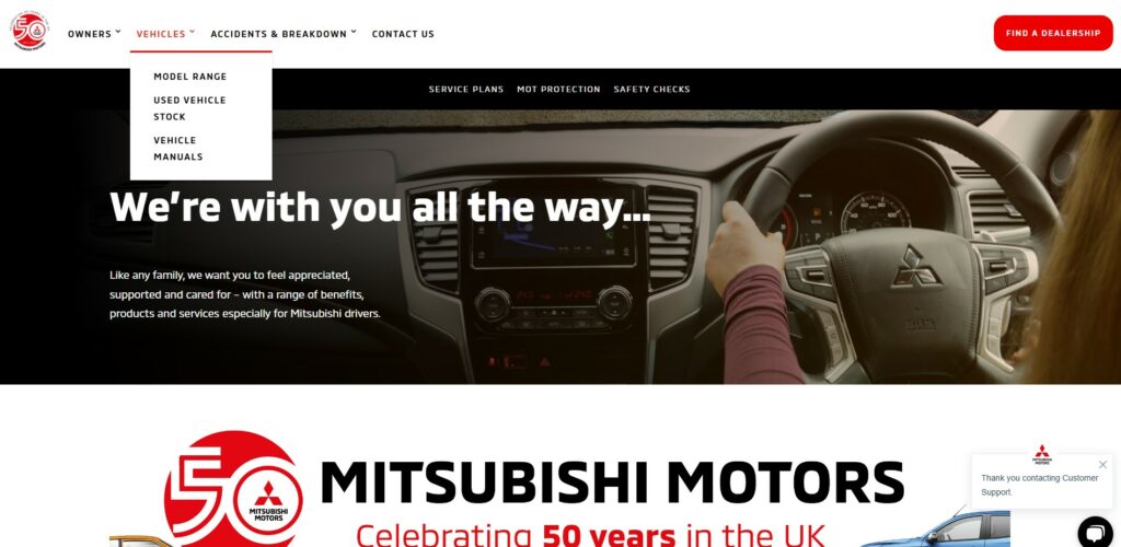
Simplify your menu and make it intuitive, whether it’s grouping similar content logically or using drop-down menus sparingly. Take a look below at how Mitsubishi Motors’ web design makes all content and sections easily accessible for users, therefore enabling smooth navigation through the website.

For escort agencies, implement clear filters based on location or client preferences. For fan sites, make it easy to find trending, new, or exclusive content. Make sure the most important pages, like subscription offers or booking forms, are easily accessible without too many clicks. In other words, ensure your site is streamlined and user-friendly.
6. Your CTAs Are Weak or Nonexistent
Are your CTAs too bland… or perhaps not even there? Calls-to-action are crucial for converting visitors, yet they’re often overlooked.
No one’s going to subscribe, buy a product, or book an escort if you don’t guide them with a clear, enticing CTA. Whether you want visitors to book a service or purchase a toy, they need that extra push to take action.
How to Fix It:
Make your CTAs bold, visible, and action-oriented. Use strong, clear phrases like “Unlock Exclusive Content,” “Shop Now,” or “Book Your Dream Girl”… depending on the kind of website, of course. For fan sites, a big, eye-catching “Join Now for Exclusive Videos” CTA will work much better than a subtle “Subscribe” button hidden in the footer. Even some recent research shows that mobile-optimised and visually appealing CTAs can increase conversion rates by up to 32.5%, so don’t underestimate their power.
A little urgency never hurts to encourage conversions either – phrases like “Only a few spots left!” or “Limited Time Offer” can create a sense of immediacy and, as a result, drive conversions. Adding urgency to CTAs is likely to increase conversion rates by 332%!
7. Cheap-Looking Web Design
First impressions are everything in the adult industry, what with so many scammy websites out there. A poorly designed, outdated, or cluttered platform will most likely encourage visitors to steer clear of it – that’s a guarantee. Even studies show that 75% of users judge a site’s credibility based on design alone, so making a good impression is crucial.
If users don’t trust your site within seconds, they certainly won’t feel comfortable providing their credit card information, subscribing to content, or booking services. And in a highly competitive market, losing that trust means losing the sale for good.
How to Fix It:
Invest in a professional, clean, and modern design that mirrors your business’s credibility. Prioritise a clutter-free layout, and avoid overwhelming visitors with excessive pop-ups or ads, which can no doubt feel spammy. Use trust signals like SSL certificates, clear privacy policies, and visible customer reviews to reassure users that their information is secure.
Escort agencies, in particular, should focus on a design that communicates discretion and professionalism, while adult e-commerce sites should highlight secure payment gateways. Including easily recognisable security badges and offering multiple safe payment methods can help put visitors at ease and encourage them to visit again.
8. Boring or Generic Content
If your adult content platform lacks variety and creativity, visitors won’t see a reason to stick around or, more importantly, pay for it.
This applies to all manner of adult sites – porn, fan content, sex toys, you name it! Whatever the business, people are drawn to unique, fresh, and engaging material that excites them and offers something different from the competition. Generic content, on the other hand, will make your site fade into the background in a saturated market.
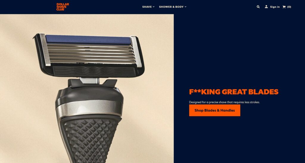
Take a look at Dollar Shave Club’s homepage below. It may seem simple, but its quirky content quickly blew up the internet…

How to Fix It:
The solution is simple: keep your content updated and tailored to your audience’s specific desires. Fan sites thrive on exclusive, behind-the-scenes content, giving users an intimate connection that keeps them engaged. For adult e-commerce sites, consider rotating seasonal collections (like Halloween-themed toys or Valentine’s bundles) and offering detailed, playful product descriptions that not only sell but entertain.
It also helps to regularly update your blog with naughty, informative posts – think tips and tricks for beginners, product guides, and industry insights to keep visitors returning for more.
9. Overcomplicated Checkout Process
We’ve all been there – adding something exciting to the cart, only to abandon it halfway through because the checkout process is a little too complicated.
Well, unsurprisingly, it’s a common problem for many websites, where complex forms, hidden fees, or unnecessary steps create friction. A long or confusing checkout process is one of the quickest ways to lose a potential sale.
How to Fix It:
Follow these steps to simplify checkout:
Minimise the Number of Steps to Complete a Purchase: A lengthy checkout process can be overwhelming and leads to frustration. Keep it concise by consolidating steps whenever possible. For instance, if you have separate pages for billing and shipping information, consider merging them into a single page.
Allow Guest Checkouts to Save Time: Forcing customers to create an account can deter new users who might prefer a quicker process. Implementing a guest checkout option reduces friction and allows users to complete their purchases without unnecessary delays.
Mark Mandatory Fields and Use Auto-Fill Options: Unmarked or confusing forms lead to more errors, slowing down the checkout process. Make required fields clear by using asterisks or labels like “required.” Additionally, auto-fill options speed things up; for instance, when a user starts typing their address, suggestions should appear based on their input, allowing them to select the correct one quickly.
Keep Costs Transparent to Avoid Last-Minute Surprises: Unexpected fees—like shipping, taxes, or service charges—are one of the top reasons for abandoned carts. Display all costs upfront on the product page or in the cart summary so users aren’t surprised at checkout.
Check out Greenhat’s comprehensive checkout optimistation checklist for more details.
Let’s Get Those Conversion Rates Up!
If your adult website isn’t converting, there’s likely more than one issue at play. But the good news? Each problem has a solution. By improving the user experience, speeding up load times, clarifying your value proposition, and employing strategic CTAs and retargeting, you can turn traffic into conversions.
Want to make sure you’re covering all the bases? Download our free checklist or reach out to Adult Creative and start maximising your conversion potential today.
Still not sure what kind of adult business you want to set up? Before reading on, be sure to check out our blog on the Top 5 Adult Business Ideas to learn more.


